JAM Photography
(a)
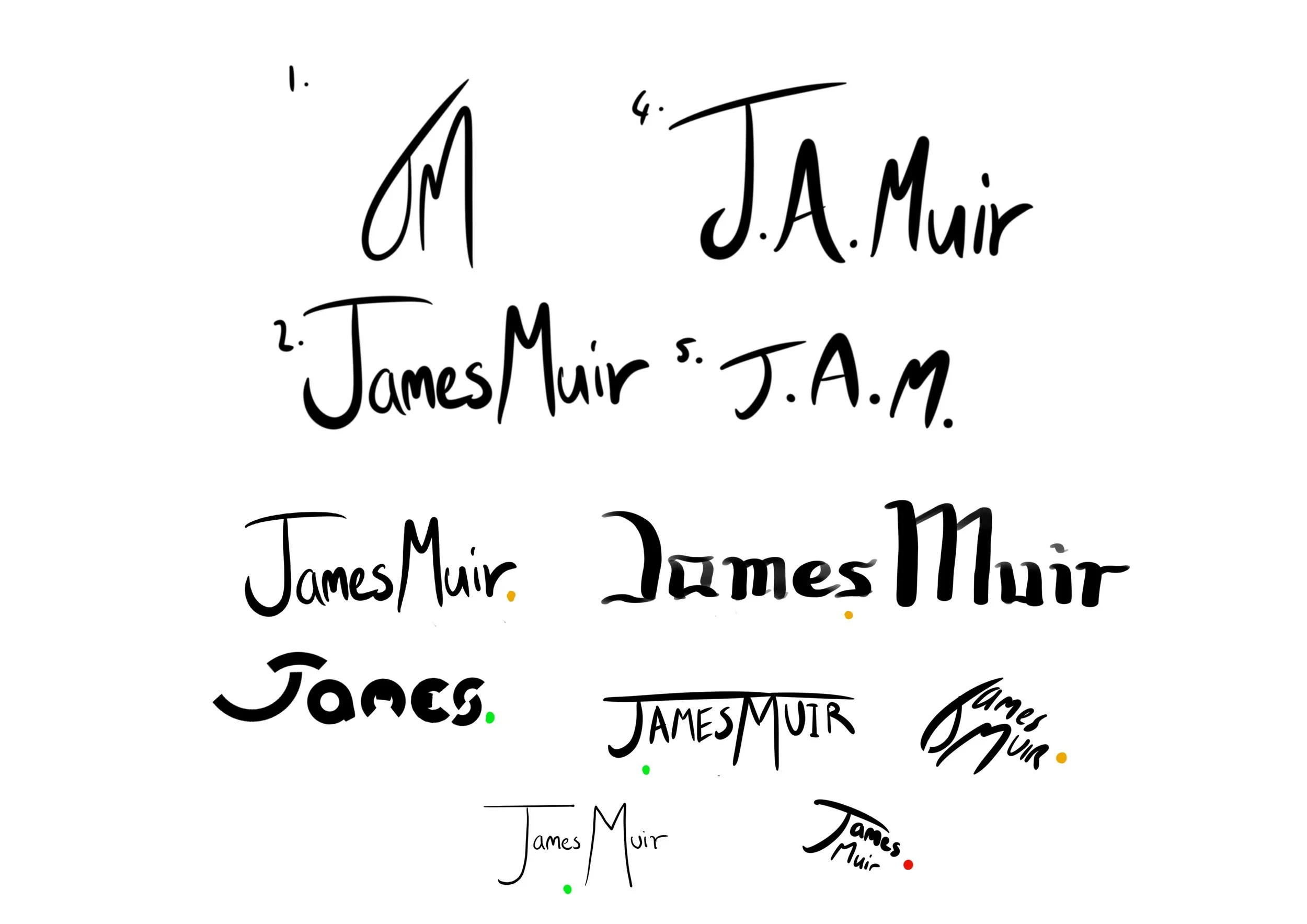
I was tasked to make a logo for a photographer so they could start their own business. They wanted a signature style logo that had their initials and still has something eye catching.
(b)
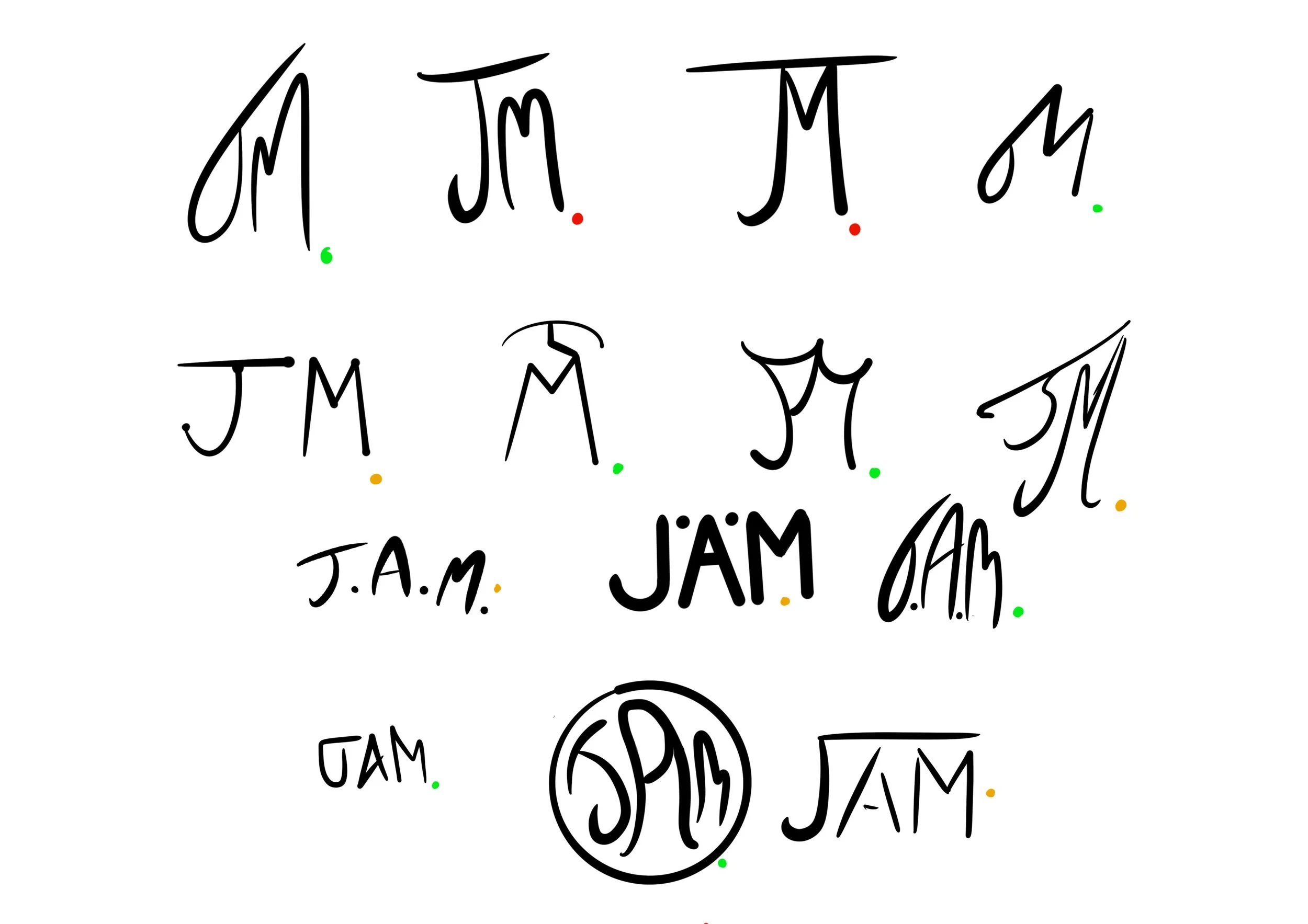
I began with sketches to create a looser calligraphic style, as we went back and forth over what was wanted we settled on the initials as it stood out more and had a bolder and more memorable name.
(c)
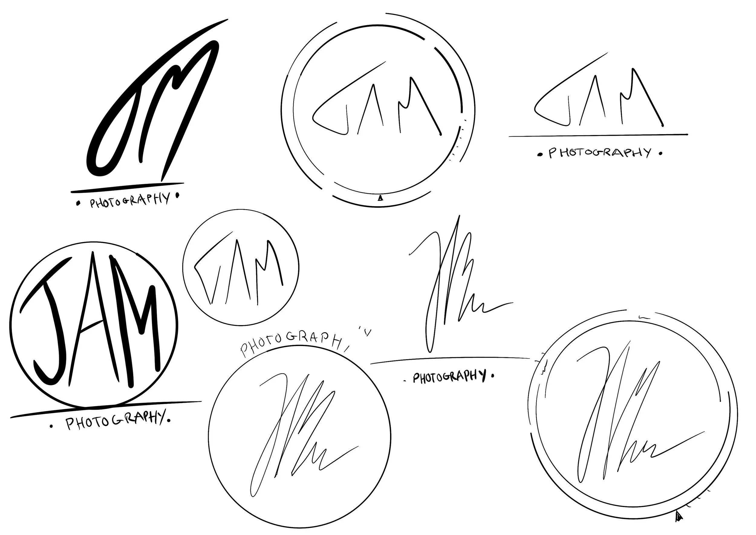
The client wanted the logo to be encased in something circular. To create something even more eye catching but also relevant I added some details to make it look like a lens, and then at smaller sizes it has a simple circle look.


