The Pug & Pom
(a)
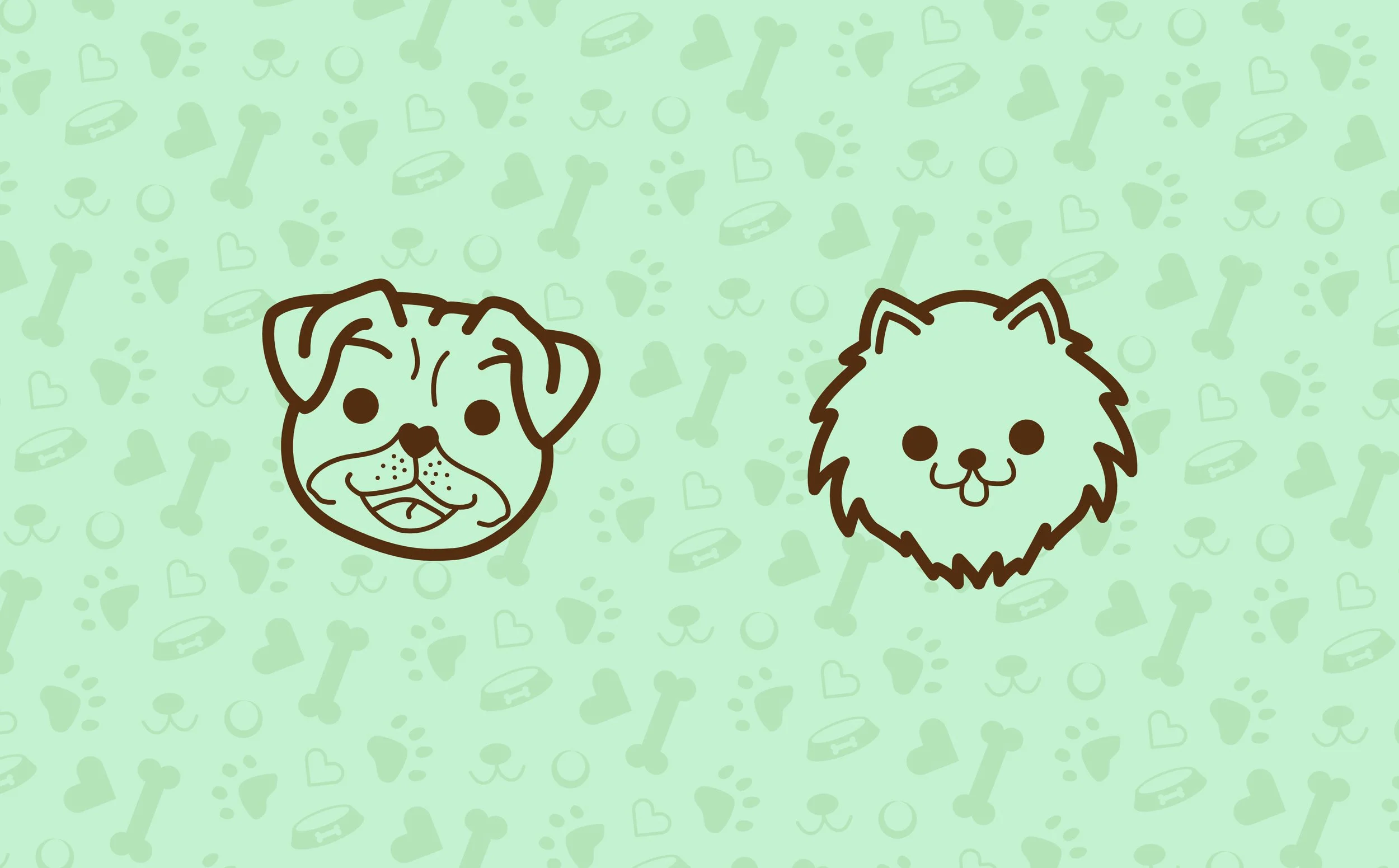
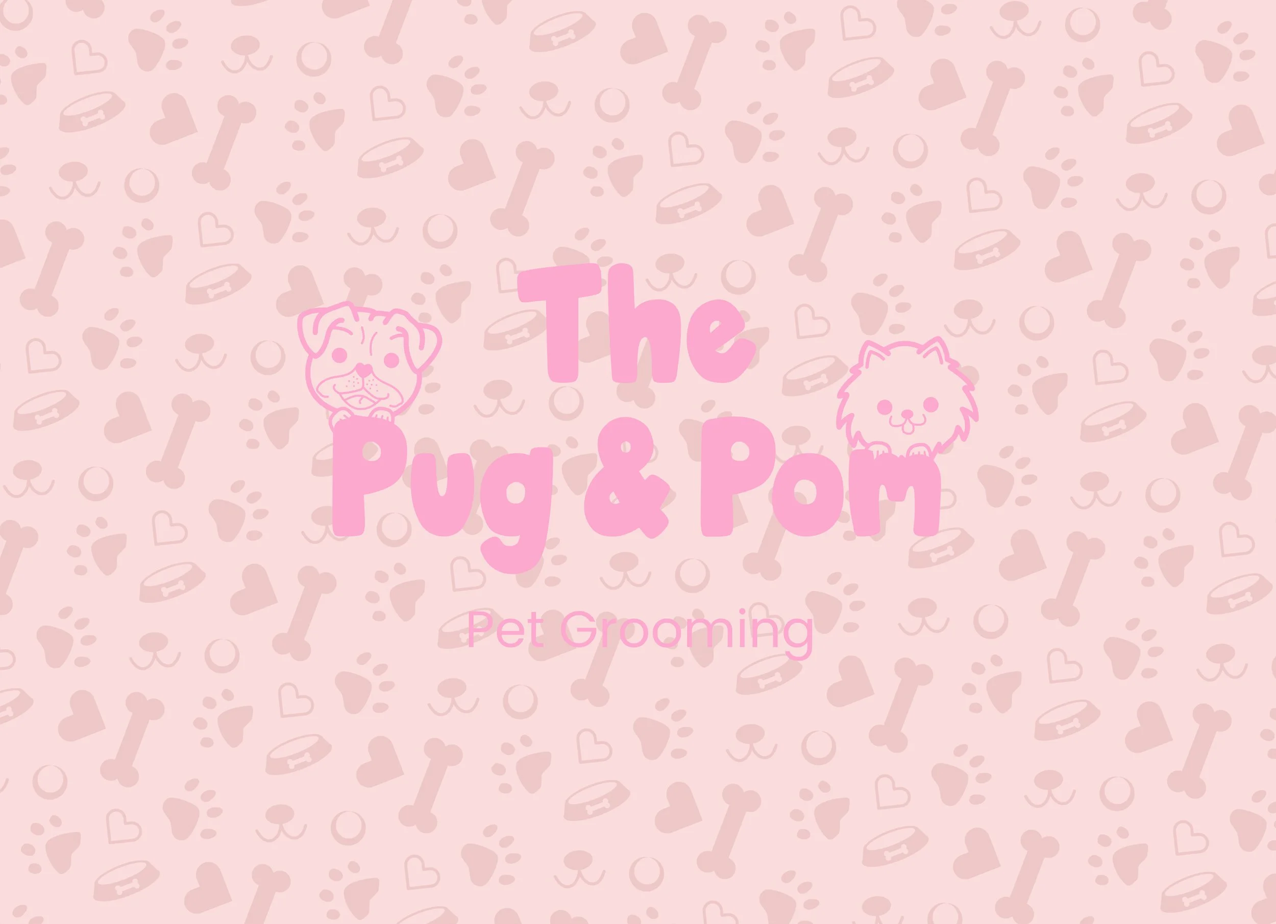
This brand was created to be friendly and engaging. Illustrations of the two dogs were made to represent the two owners of the company.
(b)
Icons were created as a way to create an identity between various assets, they would be present in a pattern on business cards, appointment cards, flyers and the sign on their door.
(c)
The typography was chosen as a whimsical and fun addition to the illustrations and is used as a means for the dogs to interact with. Colours used were made to resemble various ice cream flavours.